Project
Gold for Cash
Client
Oliver De Vitre
Location
Los Angeles, US
Category
logo, identity, website, development
Year
2023
Team
Theo Ford
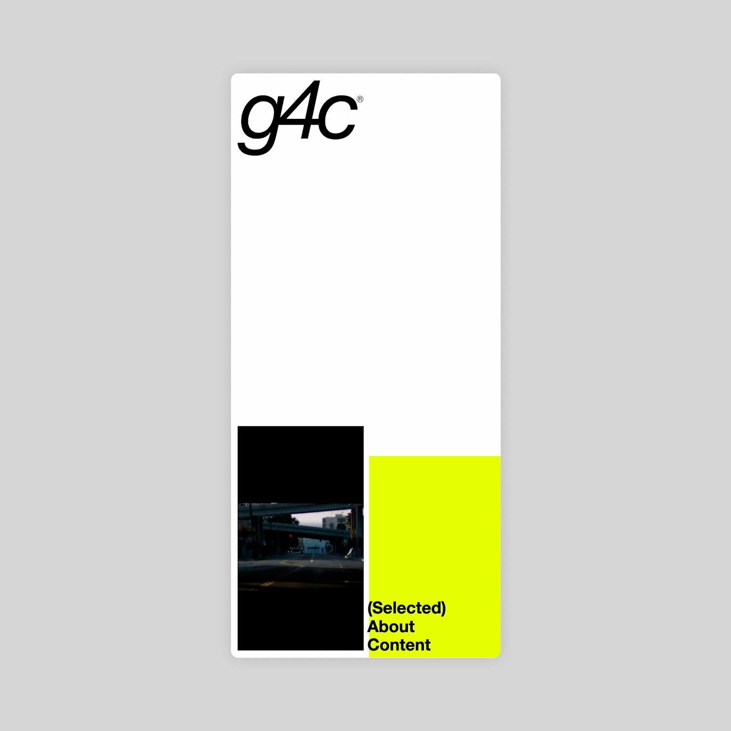
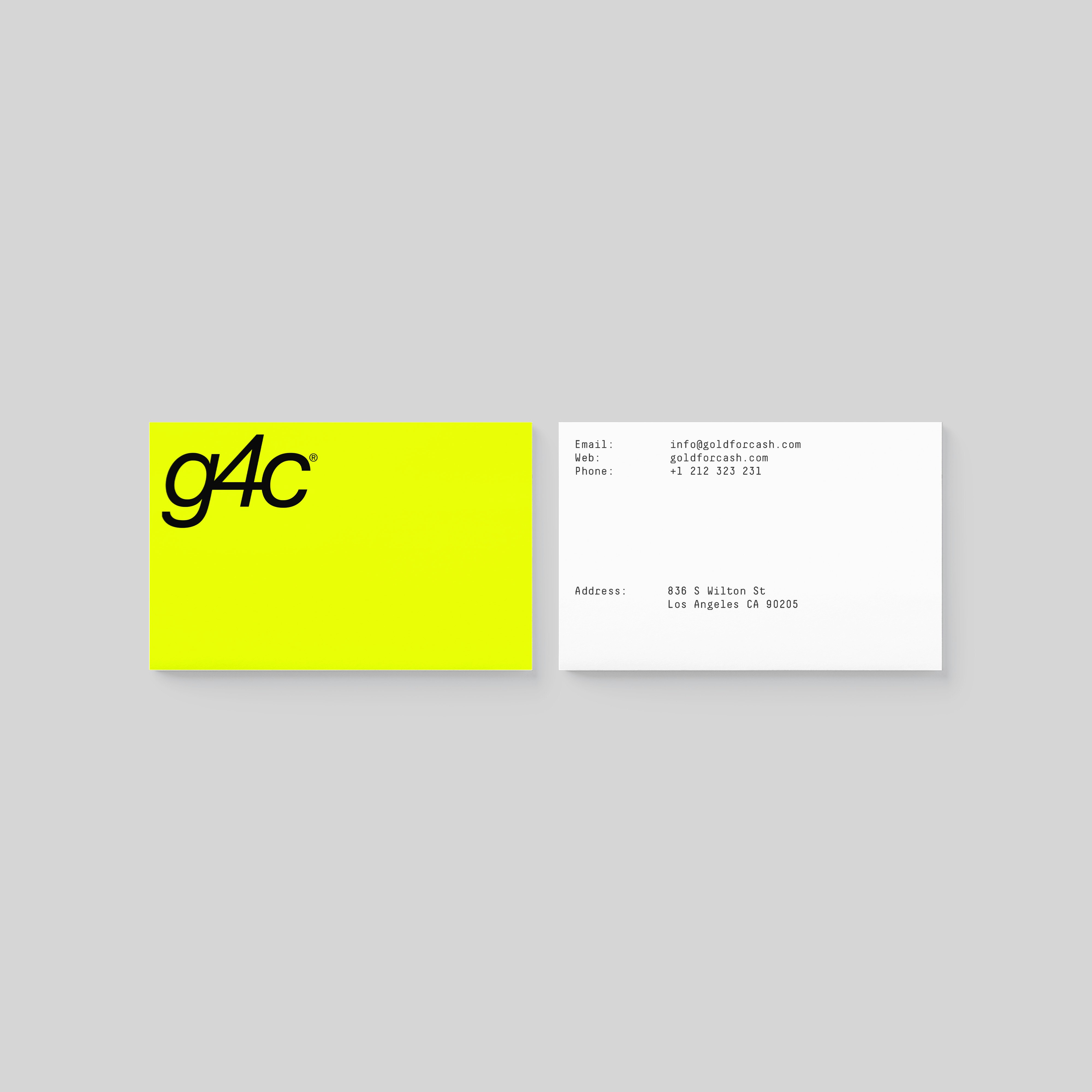
Identity and website design & build for Los Angeles based advertising consultancy Gold for Cash – founded by Oliver De Vitre (previous Nike, R/A). Oliver was interested in references from 90’s postmodernity. My approach was to honour key elements of those designers, but create something that didn’t feel like a pastiche, would fit in in today's landscape and age well.
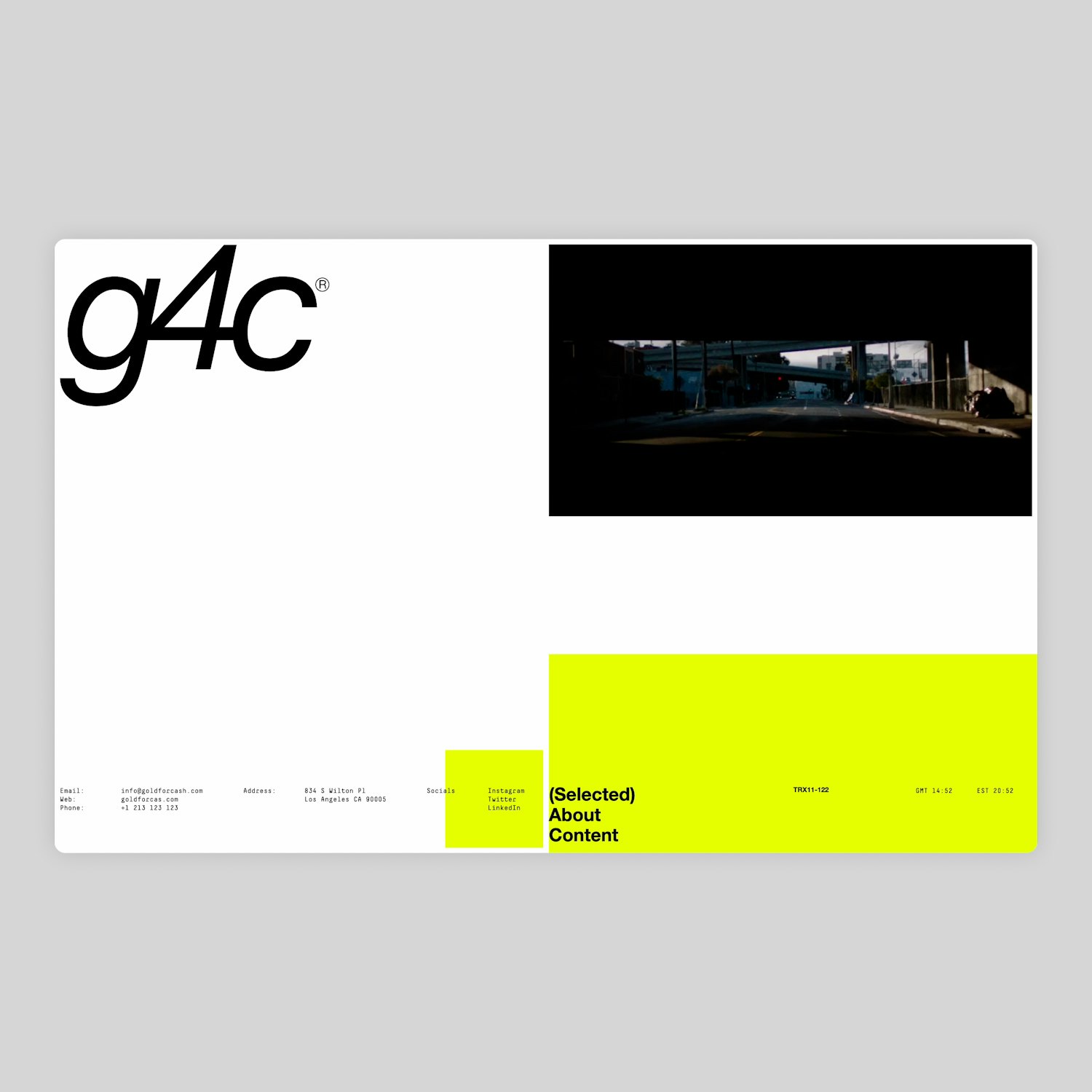
The ambition on the site was to have a long scroll of content, so the user wouldn’t have to navigate to different pages so I came up with a simple layout system that created rhythm and variation, interspersing pull quotes advertising his approach within the projects. Once the underlying grid was in place, a level of boldness was created through an animated background that revealed parts of the grid, and use of the neon yellow drawing reference of the visual landscape of pawn shops.
Video Loading
Video Loading
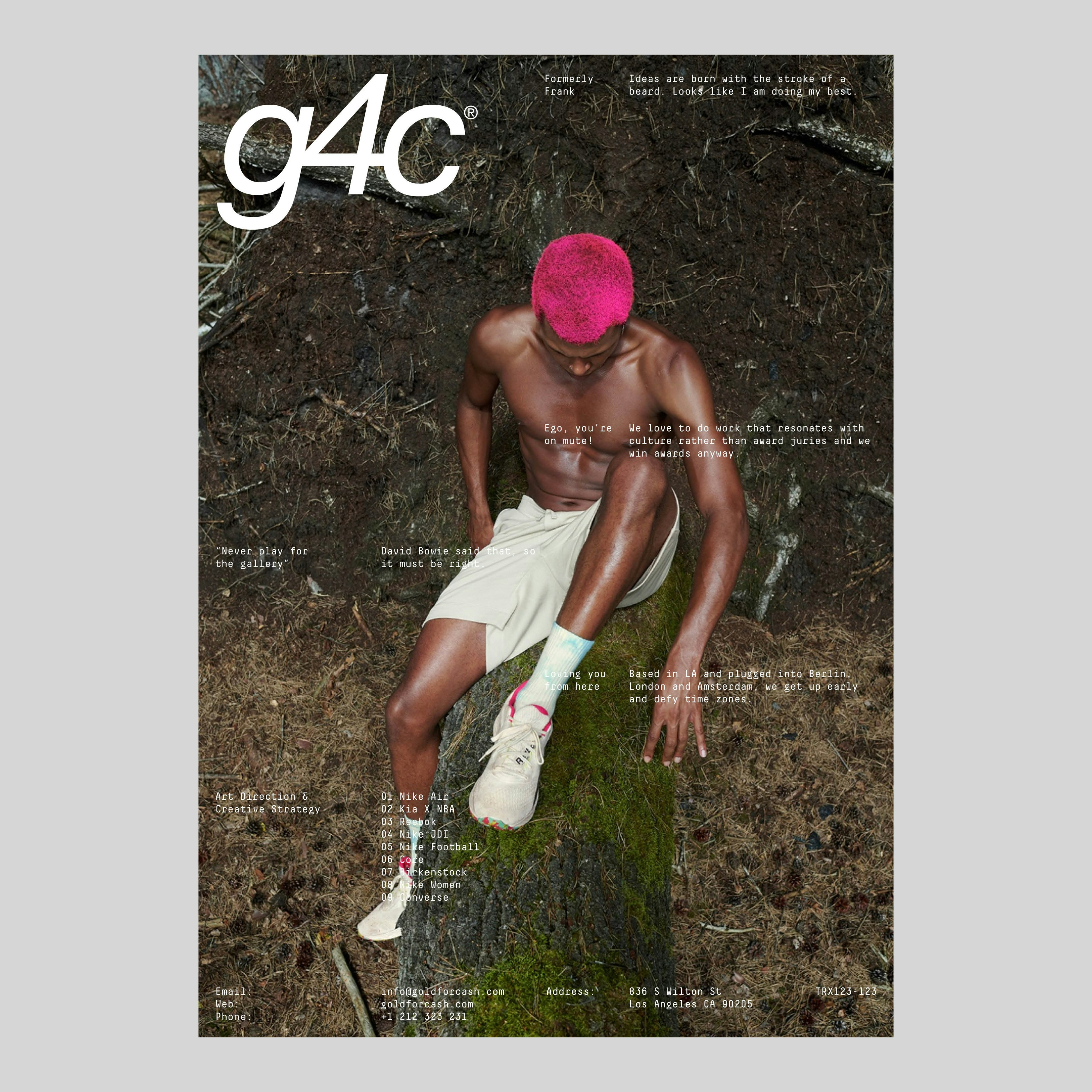
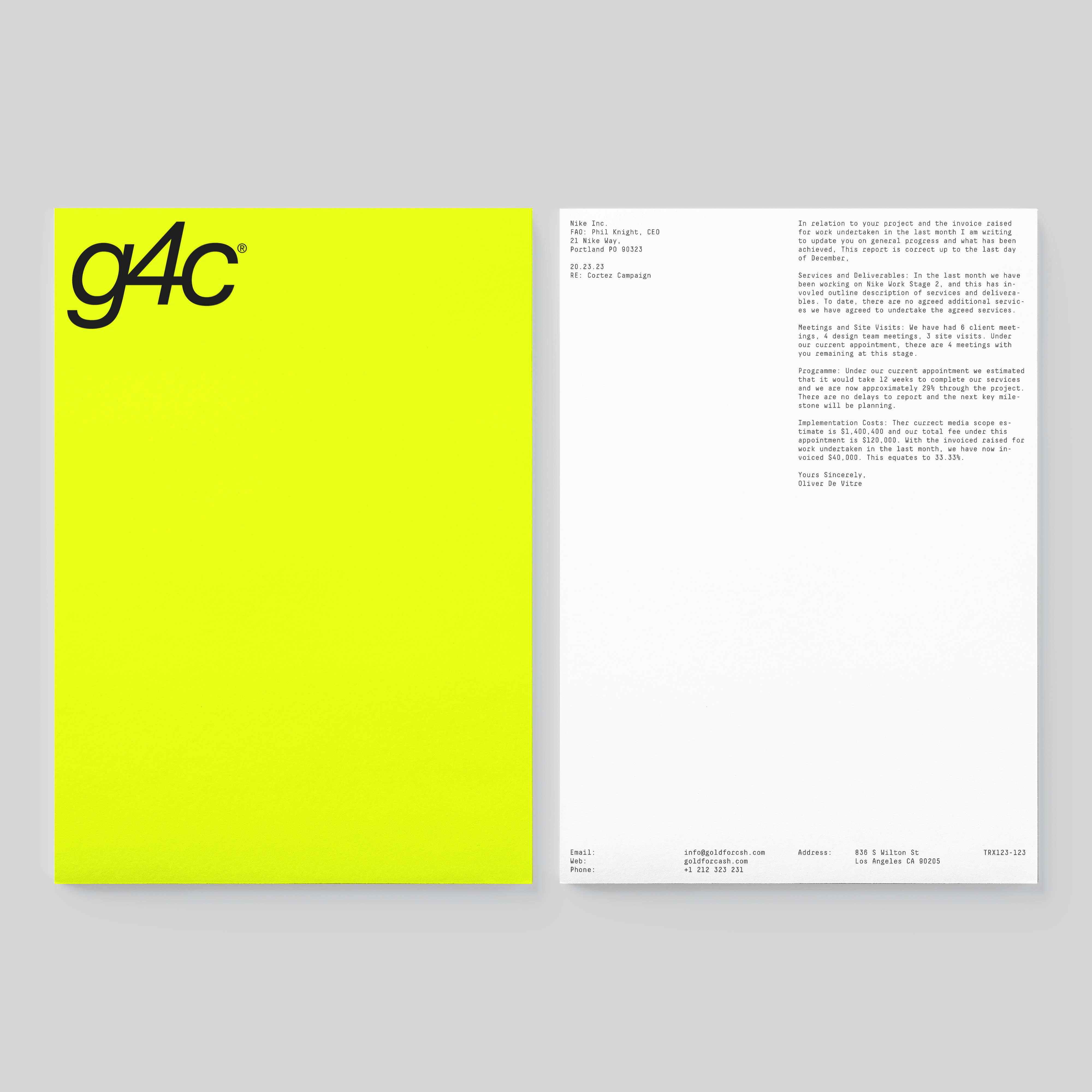
The design utilised the language of the fonts used from the period – notable works such as Aphex Twin’s use of Decimal Mono, combined with the everyday vernacular of pawn shops in LA, which the name evokes. The use of Helvetica Neue Italic and Medium, and on the logotype almost uncomfortably tight kerning in addition to abbreviating the name of the company G4C as the primary logo, creates a design which pays homage to the references whilst feeling current.
Video Loading
