Project
Magnus Menzefricke
Client
Magnus Menzefricke
Location
London, UK
Category
identity, logo, website, development, print
Year
2025
Team
Theo Ford
Magnus Menzefircke is a German architecture practice that has been based in London for the past 10 years.
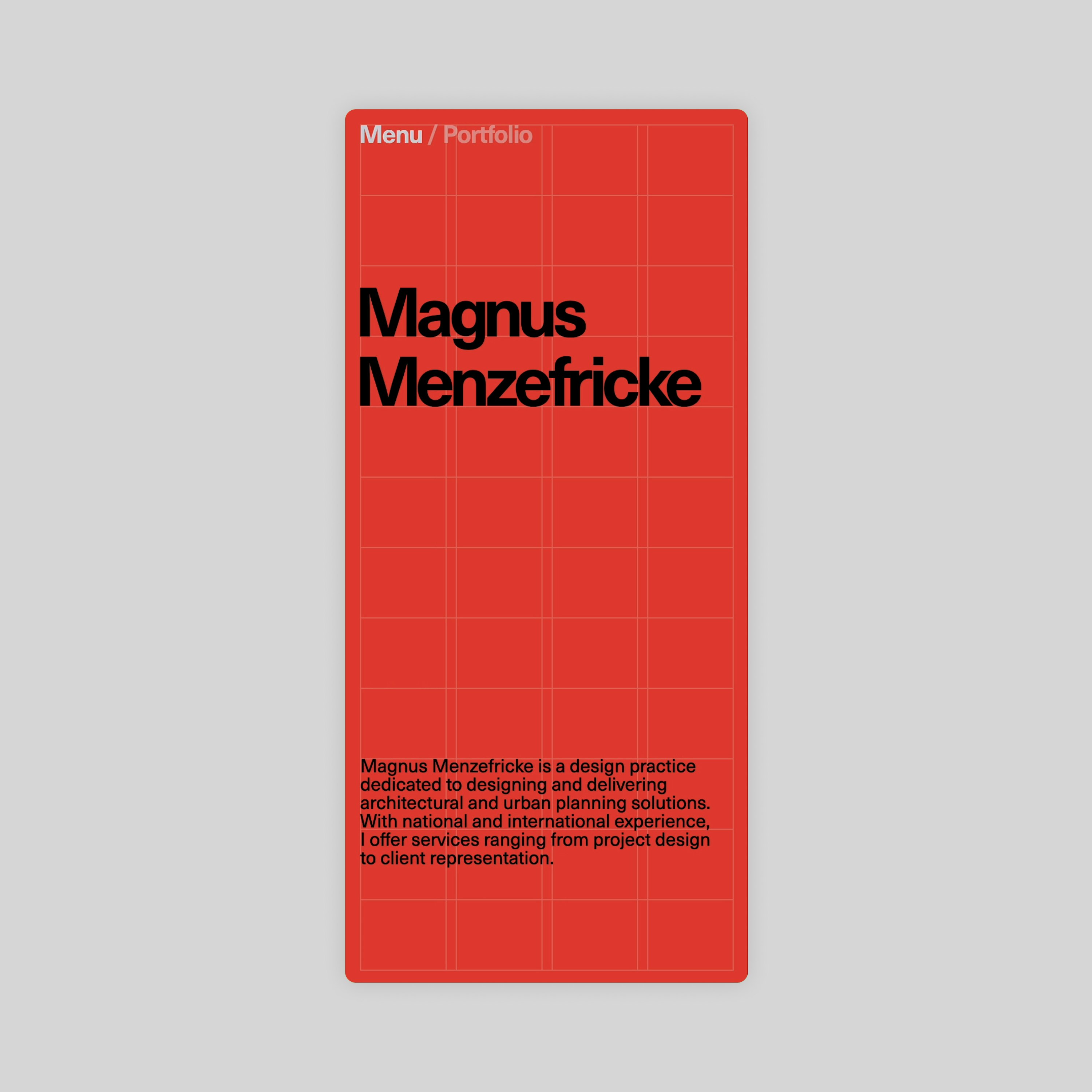
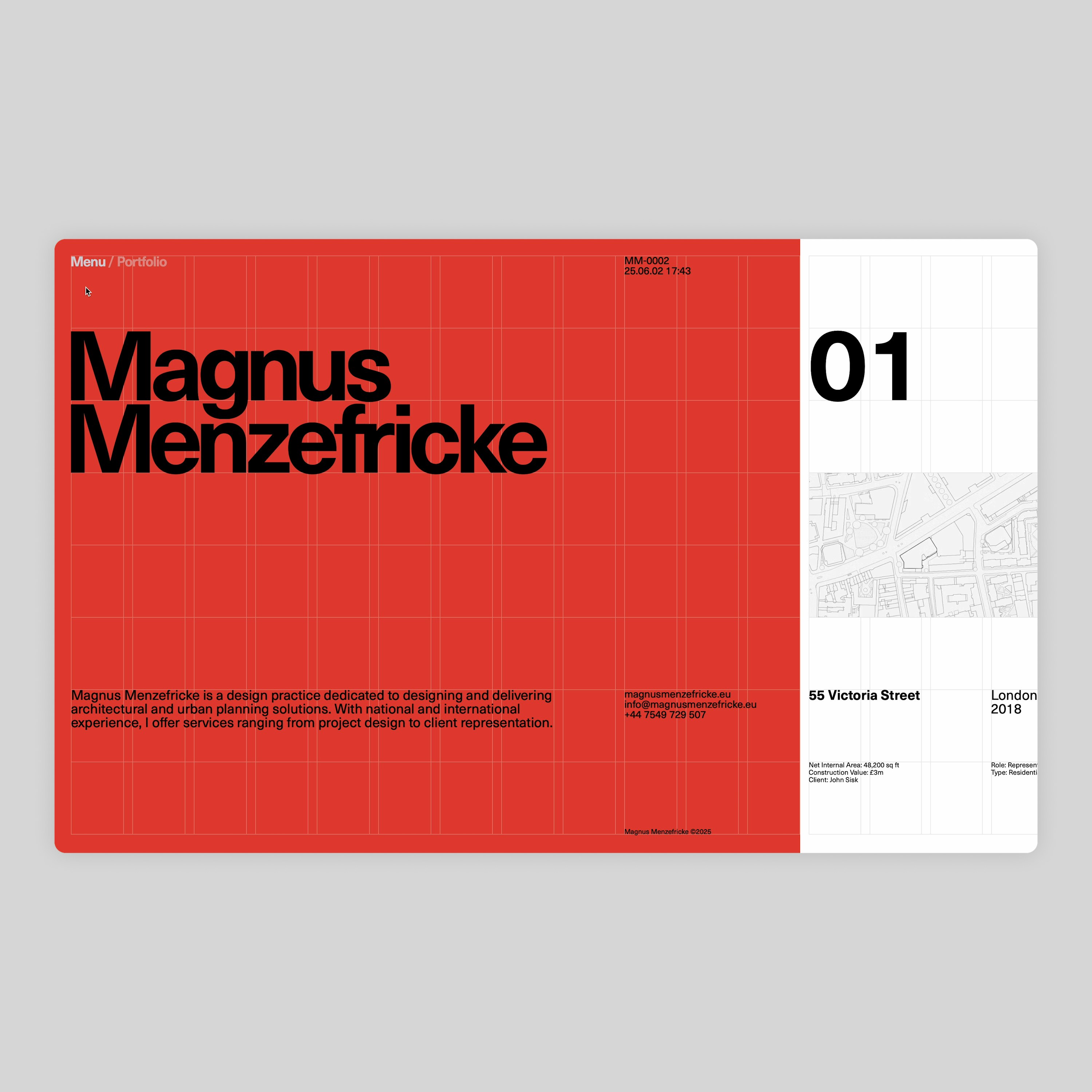
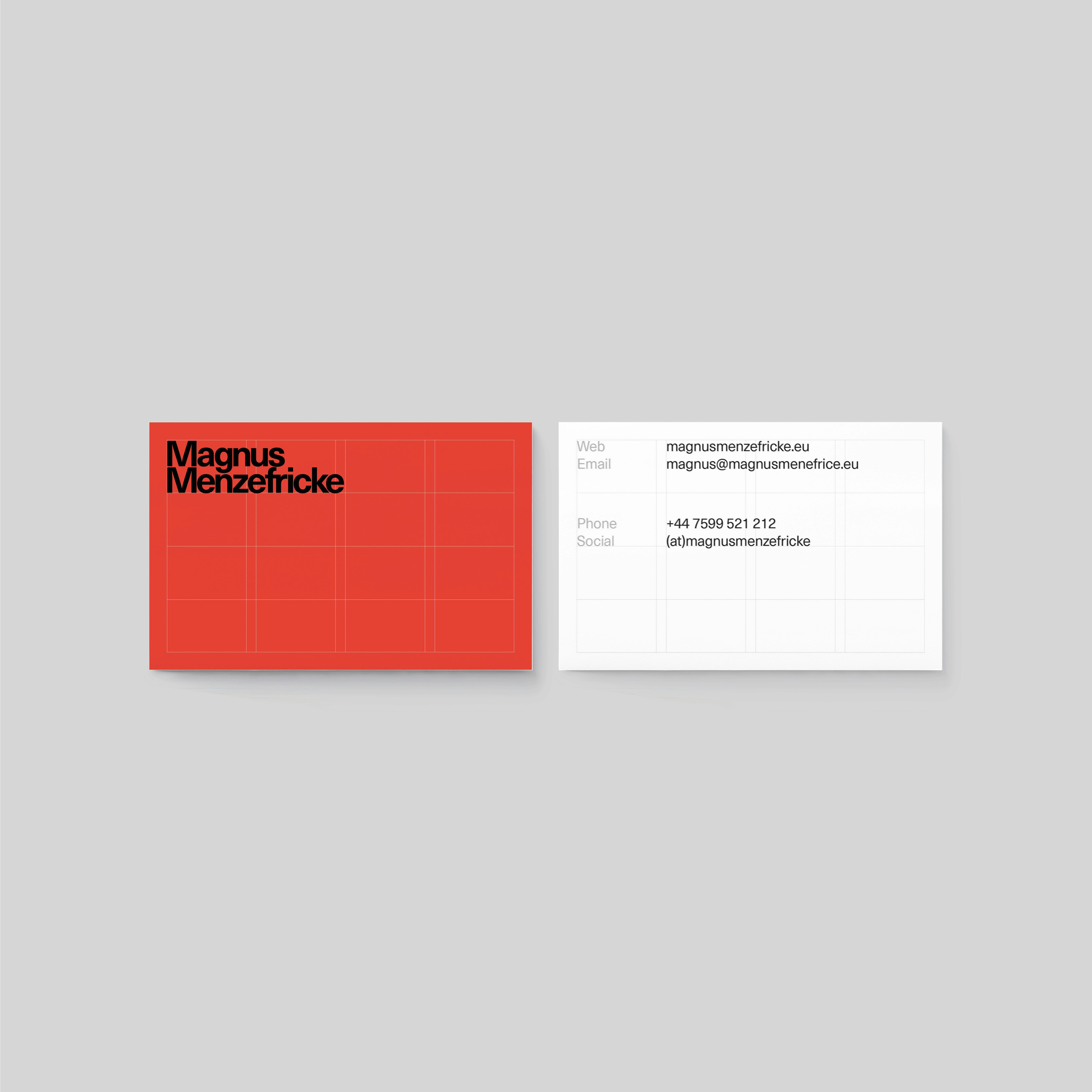
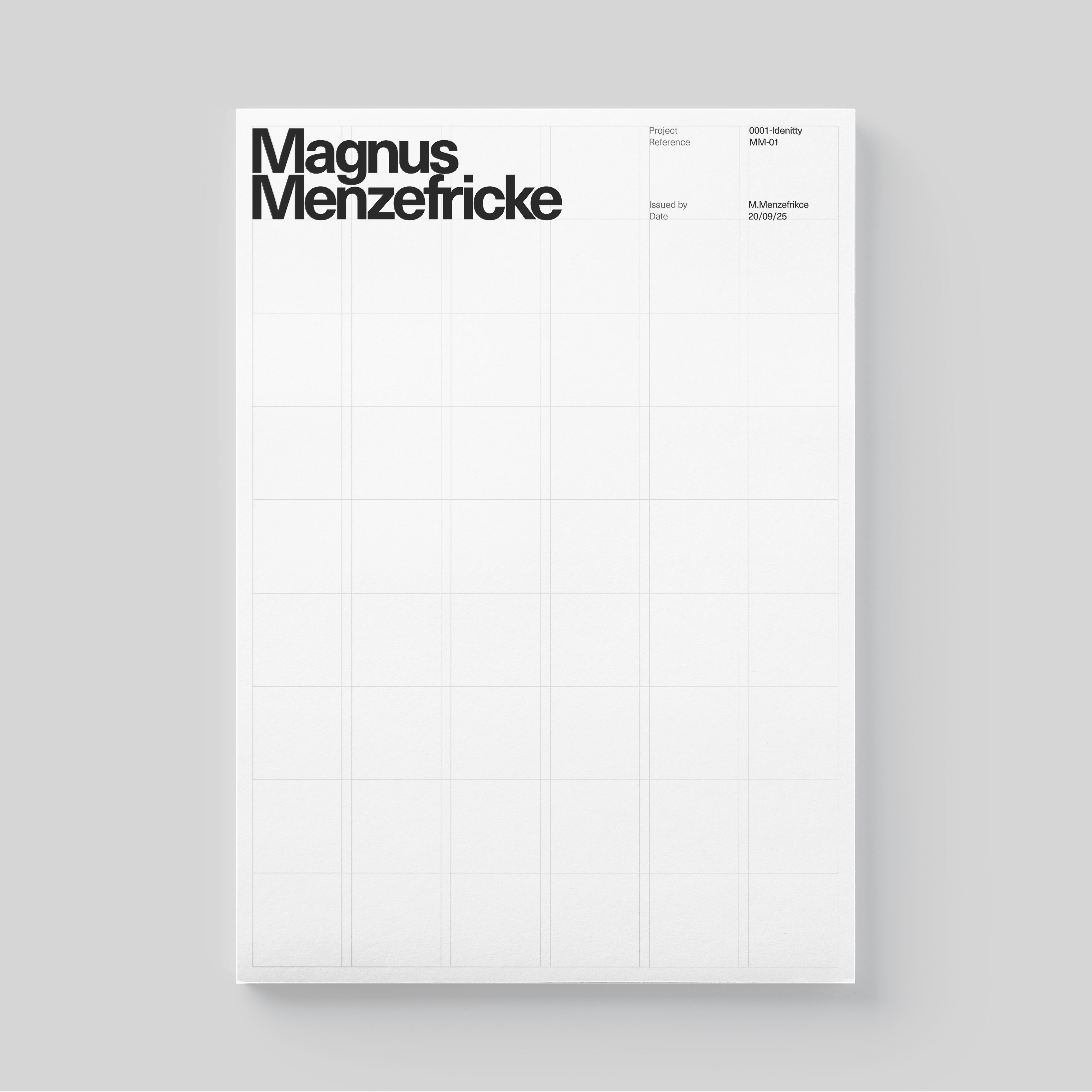
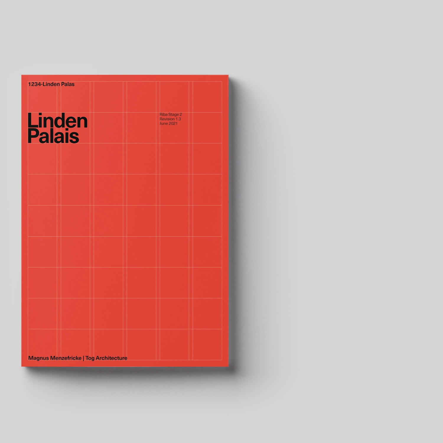
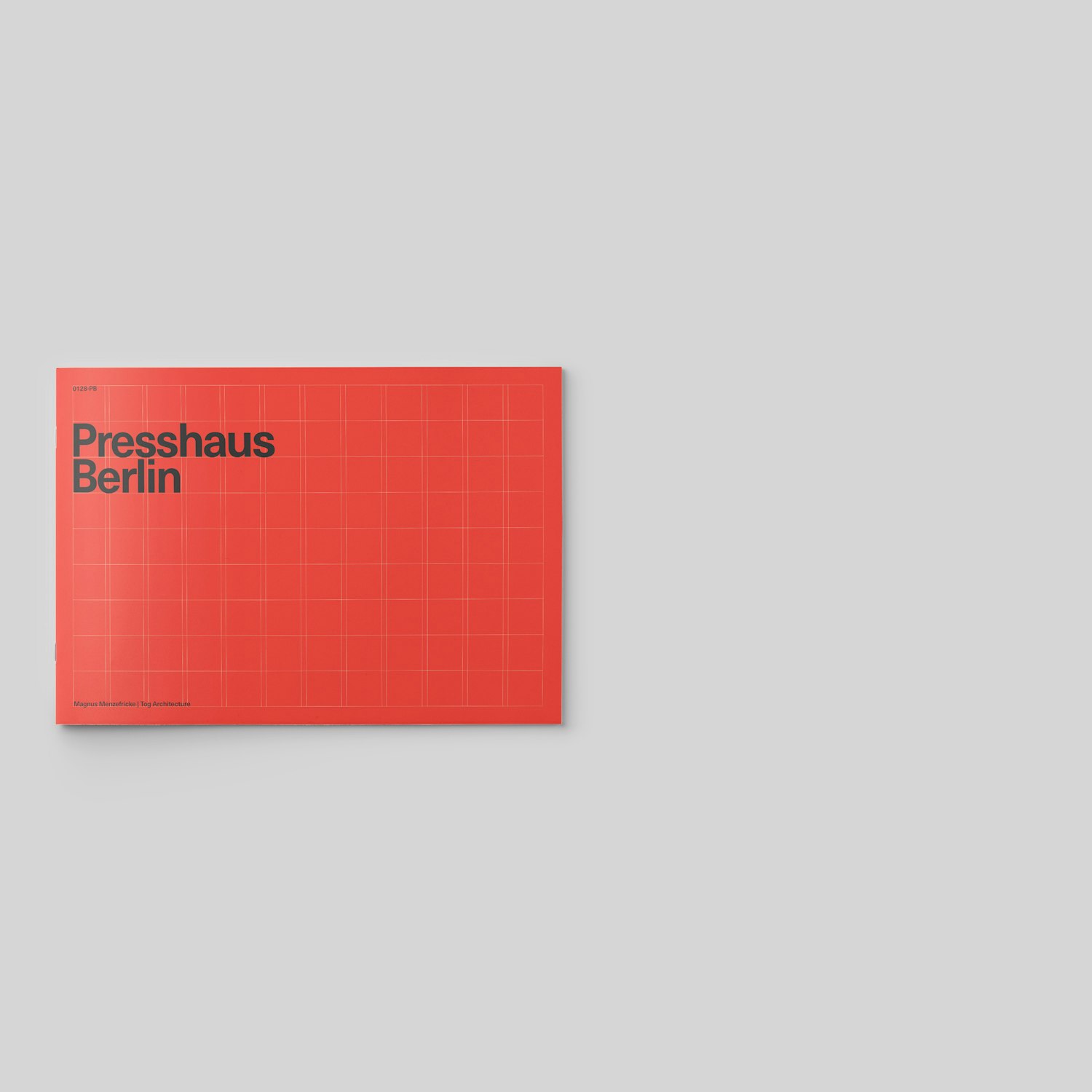
Magnus came to me with a fairly specific set of criteria – he wanted to use the colour vermillion, a modernist sans-serif and ideally explore having a horizontal scroll on the homepage. The obvious reference that came to mind was Josef Muller Brockman’s ‘Grid Systems’, required reading for anyone starting out in Graphic Design. I decided to try and expand on some of the design moves within this seminal work, but adapt and expand upon them to be fitting for a digital context. Thus the visible use of the grid was introduced.
The homepage features an animated slideshow of images and drawings from his projects, that playfully explores their placement within the grid. And vertical scroll action to achieve horizontal movement. On mobile the arrangement is adapted to work for a portrait aspect ratio, and images become centrally aligned within the grid.
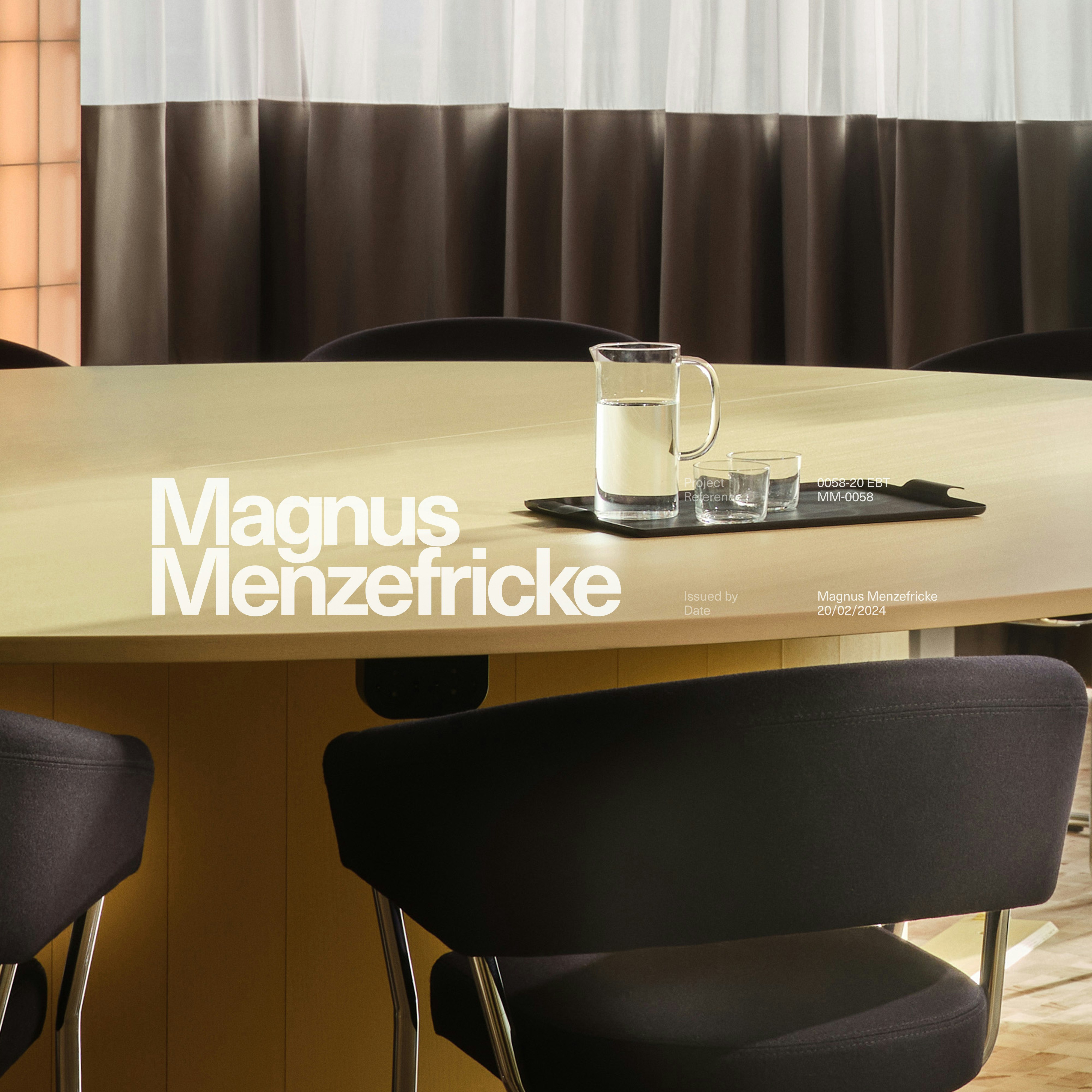
The project pages have a distinctly editorial feeling to them, the graphic language recedes into the background, enabling the user to focus on the imagery and allowing Magnus to tell stories about his design decisions. The proportions of the images however directly correlate to those placed within the underlying grid, to ensure a subconscious aesthetic through line between the different sections of the site.
The typeface used was Neue Haas Unica, as this simply felt the most fitting for the Anglo/Central European design tone that felt reflective of Magnus’s practice.
Video Loading
Video Loading
Video Loading
Video Loading
