Project
Rustic Canyon
Client
Beth Earl
Location
Los Angeles, US
Category
identity, film, performance, website, development
Year
2017
Team
Theo Ford
Rustic Canyon is a fledgling production company dedicated to creation of original documentary and comedy. The name is reference to the location ‘Rustic Canyon’ – a neighbourhood within the Pacific Palisades, Los Angeles which holds deep sentimental value for the founder Beth Earl.
I began the project by heading to the public library to research the history of Rustic Canyon the location. I learned that in 1930 after a series of wildfires, Frederick Law Omsted Jr – the nation’s foremost landscape architect and designer of the California state park system, had come out in favour of public ownership of roughly 10,000 acres of land in and around where Rustic Canyon is situated – if this had succeeded it would have turned the area into quite possibly the worlds most visually astounding public park, available for the entire populace to enjoy, whilst simultaneously utilising it’s unique ecological variables in order to create a controllable environment for the inevitable outbreaks of wild fires, whilst minimising damage to Los Angeles as a whole.
Due to the lobbying pressure of real estate developers and land speculators, the City of Los Angeles buckled in the face of this bold civic plan, and cut up the land piecemeal for private development.
Video Loading
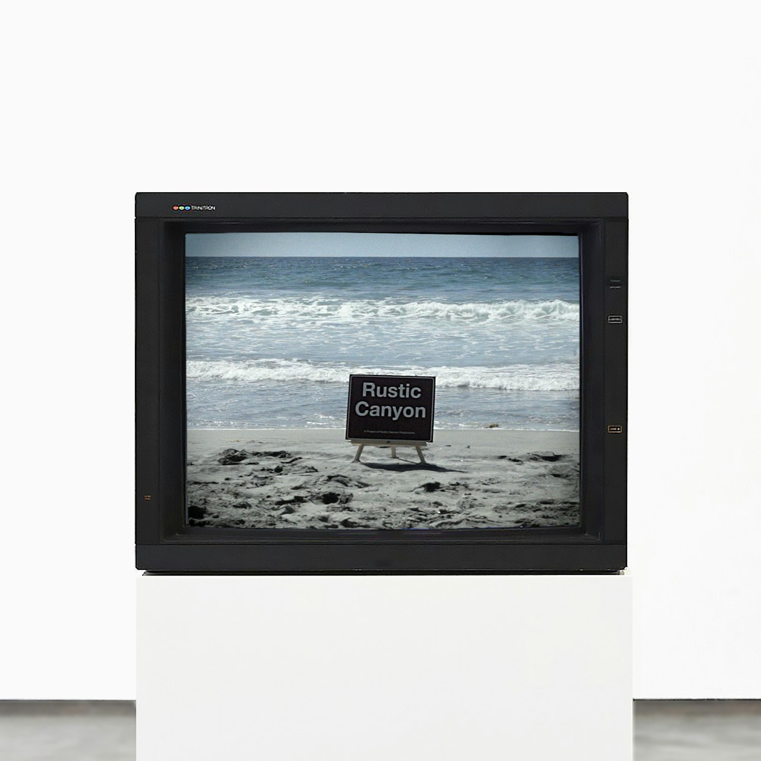
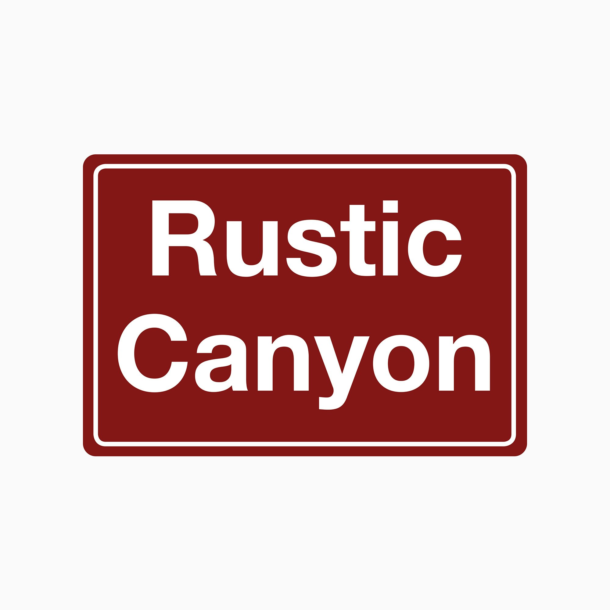
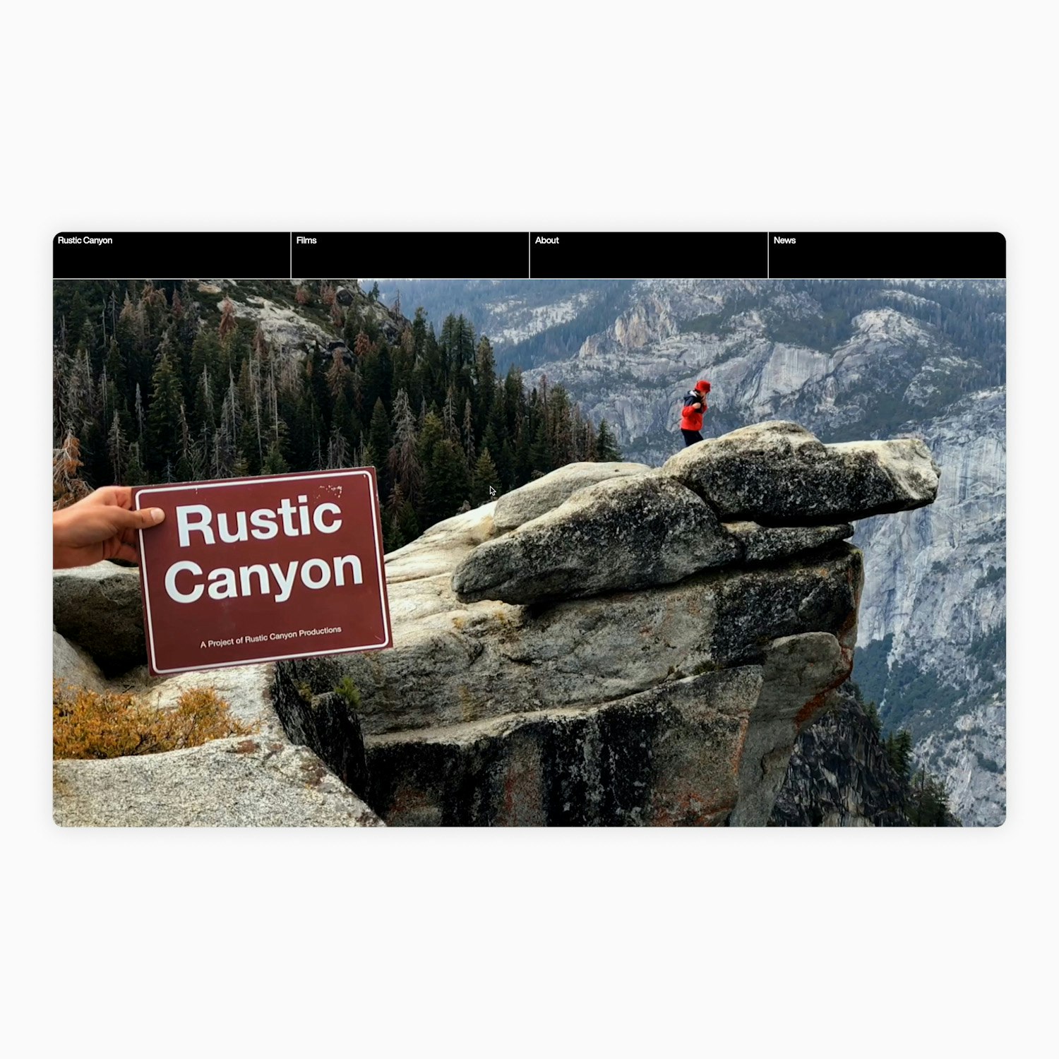
In response to this, I decided that whilst creating a visual identity for the production company ‘Rustic Canyon’, I was also going to brand ‘Rustic Canyon’ the location, and bring it back into Frederick’s bold scheme of public ownership, by literally 1 for 1 using the visual language of the state park’s program.
I created a sign to this effect and then travelled the length of California placing it in different contexts and filming it as an experiment. The result of this, was that myself and Beth decided that to challenge the notion that the primary identifier for a production company – the animated ident at the start of the film – had to remain 100% consistent.
We invited crew members to identify interesting situations on set or location where the sign could be positioned and make a short film. Each location specific piece of footage would then serve as the a unique identifier at the beginning of each of the companies projects, in which the sign would remain consistent but it’s environment would change dramatically from production to production. This would also double as a means of generating social media content.
Video Loading
Video Loading
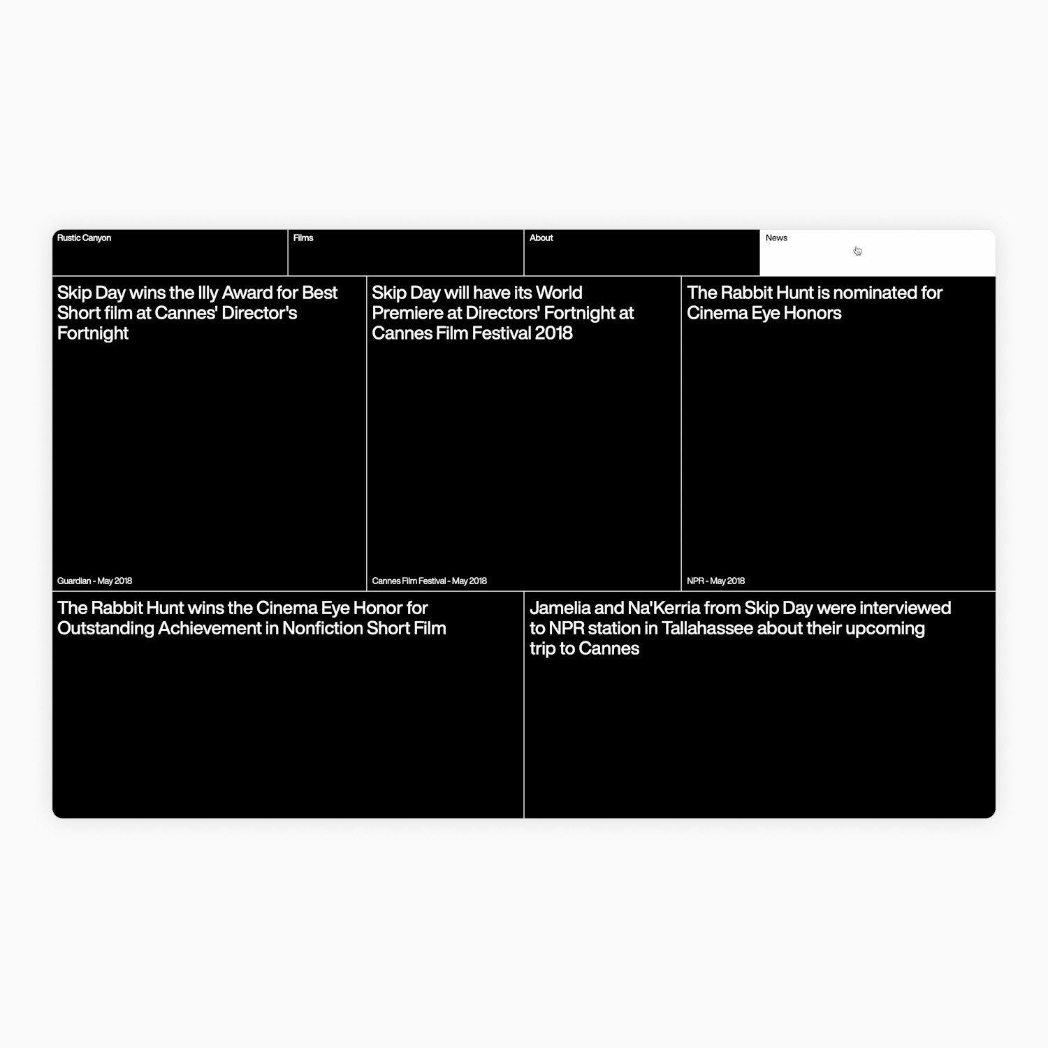
The result is an informal and playful brand identity, that is performative in nature. Which finds beauty, intrigue and comedy in the everyday experiences of the participants of this project. The website layout is constructed from three modules with fixed aspect ratio’s inspired by the dominant formats of film – 16:9, 4:3, 1:1.
